DOĞUŞ GURME ÇAY
Doğuş Gurme Çay “Gelenekten İlham Alan Modern Ambalaj Tasarımı”
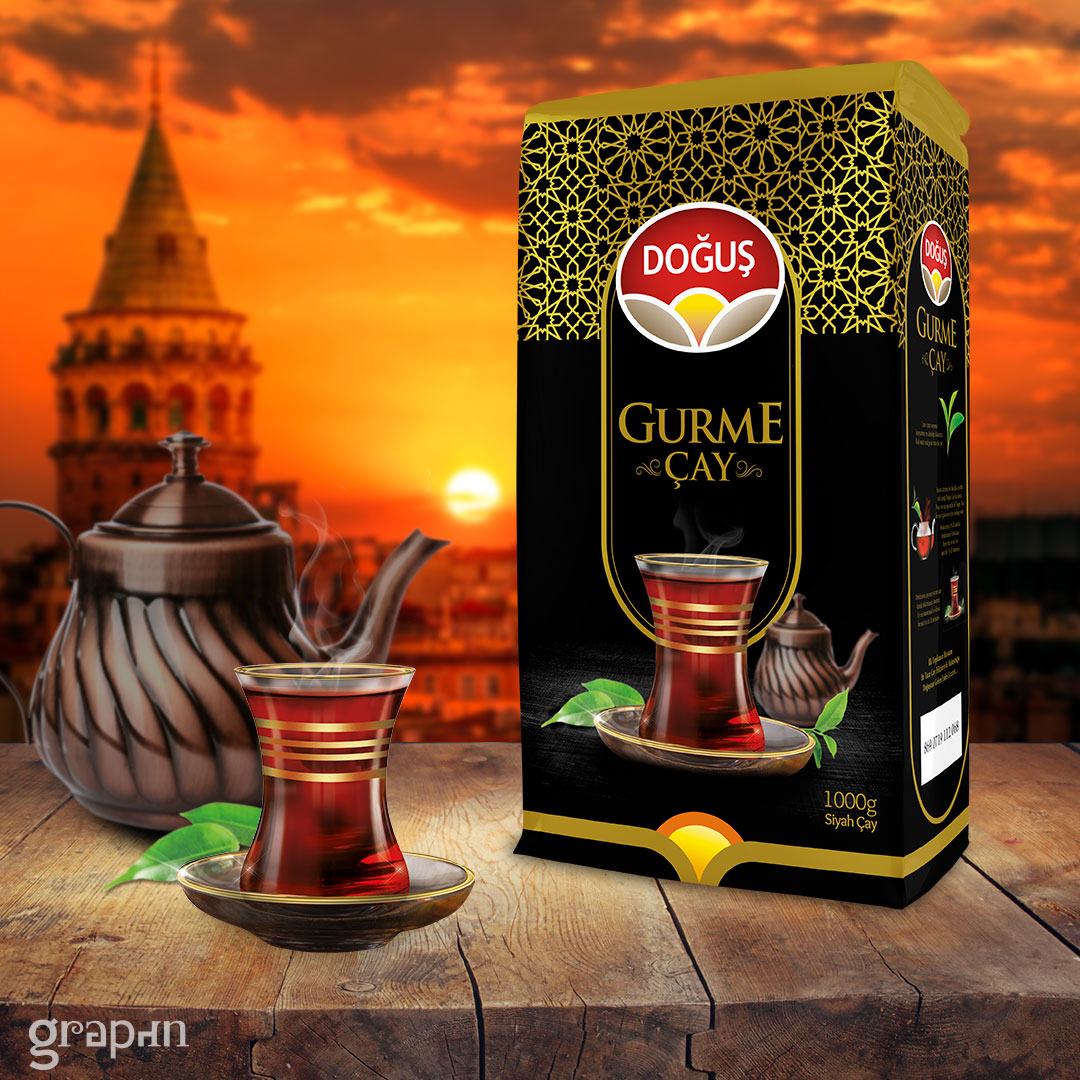
Doğuş Gurme Çay’ın yeni ambalaj tasarımı, geleneksel Türk çay kültürünü modern grafik diliyle buluşturarak raflarda hem dikkat çekici hem de öncü bir duruş sergiliyor. Tasarım, Doğuş’un kalite ve estetik anlayışını, öncelikle tüketiciyle ilk temasta olan ambalajı ile tüketiciye aktarma hedefiyle oluşturuldu.
Ambalajın temel yüzeyinde kullanılan siyah zemin, premium ürün algısını güçlendirirken, bunun üzerine işlenen altın yaldız geleneksel motifler, hem zarafeti hem de Doğuş markasının diğer çay varyantlarının yanında, gelenekselliği yansıtan özgün bir desen dili oluşturuyor. Bu desen yapısı, İslami sanat motiflerinden ilham alarak gelenekle bağ kuruyor; aynı zamanda modern çizgilerle birleşerek zamansız bir tasarım estetiği sunuyor.
Ön yüzde öne çıkan ince belli çay bardağı fotoğrafın üzerine gold bir şerit ilave ettik ki, ürüne nostaljik bir bağ kazandırdı. Öyle çok sevildi ki, bir sonraki satış kampanyasının ana mekaniği olarak birebir aynısı üretildi ve promosyon olarak dağıtıldı. Arka plandaki demlik görseli, sıcaklık ve ev ortamı hissini destekliyor. Böylece tasarım sadece göze değil, duygulara da hitap eden bütünsel bir atmosfer kuruyor.
Ambalajın altın sarısı üst kenar kaplaması ve dikkatlice yerleştirilen logosu, marka bütünlüğünü ve ürün segmentasyonunu güçlü biçimde destekliyor. 1000 gramlık büyük hacimli yapısıyla hem fonksiyonel hem de dikkat çekici bir görsellik sunuyor.
Bu çalışma, Doğuş’un marka değerini yansıtan, geleneksel dokuları modern çizgilerle birleştiren, etkileyici bir ambalaj tasarımı örneği olarak yarışmalarda yer alabilecek niteliktedir. Rafta fark edilme, kültürel aidiyet oluşturma ve tüketiciyle bağ kurma konularında başarılı bir görsel iletişim stratejisi taşımaktadır.
Doğuş Gurme Çay – Gelenekten gücünü alan, tasarımıyla geleceğe seslenen bir çay ambalajı.
Doğuş Gurme Tea “Modern Packaging Design Inspired by Tradition”
Doğuş Gourmet Tea’s new packaging design combines traditional Turkish tea culture with modern graphic language, creating a striking and pioneering look on store shelves. The design was created with the aim of conveying Doğuş’s understanding of quality and aesthetics to consumers through the packaging, which is the first point of contact with the consumer.
The black background used on the packaging's main surface reinforces the premium product perception, while the gold foil traditional motifs applied on top create a unique pattern language that reflects both elegance and tradition alongside Doğuş's other tea variants. This pattern structure draws inspiration from Islamic art motifs to connect with tradition, while also combining with modern lines to offer a timeless design aesthetic.
We added a gold strip to the prominent photo of a slender tea cup on the front to give the product a nostalgic feel. It was so well-received that an exact replica was produced as the main mechanism for the next sales campaign and distributed as a promotional item. The teapot image in the background reinforces the sense of warmth and home. Thus, the design creates a holistic atmosphere that appeals not only to the eye but also to the emotions.
The golden yellow upper edge coating of the packaging and the carefully placed logo strongly support brand integrity and product segmentation. With its large 1000-gram capacity, it offers both functionality and eye-catching visuals.
This work is an impressive example of packaging design that reflects Doğuş's brand value, combining traditional textures with modern lines, and is worthy of being entered into competitions. It carries a successful visual communication strategy in terms of standing out on the shelf, creating cultural belonging, and connecting with consumers.
Doğuş Gourmet Tea – A tea packaging that draws its strength from tradition and speaks to the future with its design.